Birlikte
Non-profit and social missions by UNICEF
![]()
Est.2023 Birlikte, meaning “together” in Turkish, is a culturally-inspired brand identity created to cultivate community and aid millions of Turkish families affected by a major earthquake. Its brandmark draws inspiration from Ottoman motifs symbolizing unity and support. Leveraging UNICEF's colors and logo within a consistent design language, Birlikte establishes an optimistic, welcoming, and child-friendly presence that attracts families and offers a cheerful community center.
Design team was Henri Kusbiantoro as a creative director, Joseph Primiani, Yuchen Liu, Yue Yu, Nicole Ismaili led by Julia McGreevy, SVP Creative Director. Brand Identity designed by Henri Kusbiantoro. Illustration by Yue Yu. BX Brand Experience Design Group / FCB Health, 2023.
Non-profit and social missions by UNICEF

Est.2023 Birlikte, meaning “together” in Turkish, is a culturally-inspired brand identity created to cultivate community and aid millions of Turkish families affected by a major earthquake. Its brandmark draws inspiration from Ottoman motifs symbolizing unity and support. Leveraging UNICEF's colors and logo within a consistent design language, Birlikte establishes an optimistic, welcoming, and child-friendly presence that attracts families and offers a cheerful community center.
Design team was Henri Kusbiantoro as a creative director, Joseph Primiani, Yuchen Liu, Yue Yu, Nicole Ismaili led by Julia McGreevy, SVP Creative Director. Brand Identity designed by Henri Kusbiantoro. Illustration by Yue Yu. BX Brand Experience Design Group / FCB Health, 2023.
In October 2023, UNICEF partnered with Rönesans Group to launch an initiative in Malatya, Türkiye — Press Release

Birlikte’s visual identity draws inspiration from Ottoman Turkish geometric patterns, a nod to the heritage of the children, adolescents, and families affected by the disaster. United, they are healing and reviving together to establish support hubs (Birlikte) within the temporary living spaces.


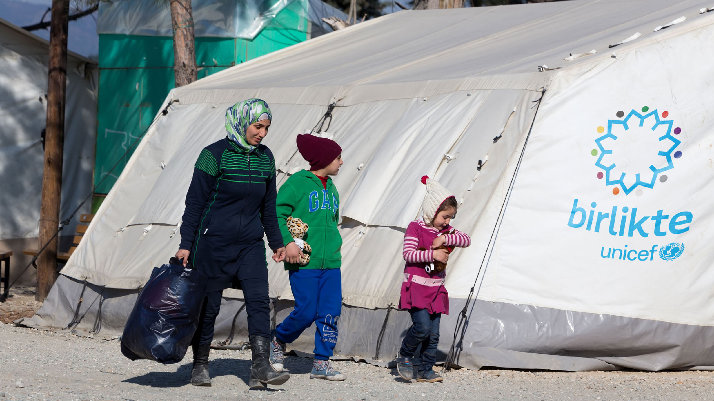


Illustration of the hubs by Yue Yu / BX Brand Experience Design Group


