Aetna
Healthcare
![]()
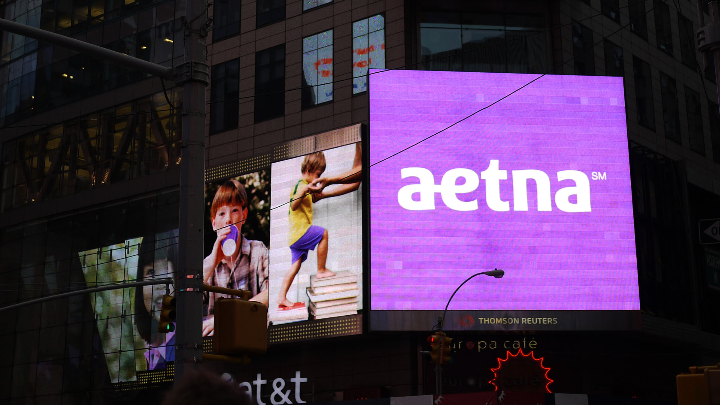
Est.2012 Aetna total rebrand: visual identity, design system, iconography for one of the biggest health insurance companies in the US. We came out with the idea of “connection” and invited the typographer Mike Abbink to design and craft a selected bespoke logotype. Known as a ligature, the connection of the two letters “a” and “e” was used in the Aetna logo back in 1860 and returns today as a unique symbol, bringing back the heritage in a fresh, modern and unique yet an approachable way. The visual system and iconography also celebrate the idea of connection by using the DNA of the counter space of the logotype.
Recognition
2012 Gold Business Marketing Global ACE Award
2013 Merit Award REBRAND 100
The Design team was Erika Nishizato, Henri Kusbiantoro, Robert Schroeder led by Henri Kusbiantoro as design director and Doug Sellers as creative director. Logotype designed by Mike Abbink. Siegel+Gale, New York.
Healthcare
Est.2012 Aetna total rebrand: visual identity, design system, iconography for one of the biggest health insurance companies in the US. We came out with the idea of “connection” and invited the typographer Mike Abbink to design and craft a selected bespoke logotype. Known as a ligature, the connection of the two letters “a” and “e” was used in the Aetna logo back in 1860 and returns today as a unique symbol, bringing back the heritage in a fresh, modern and unique yet an approachable way. The visual system and iconography also celebrate the idea of connection by using the DNA of the counter space of the logotype.
Recognition
2012 Gold Business Marketing Global ACE Award
2013 Merit Award REBRAND 100
The Design team was Erika Nishizato, Henri Kusbiantoro, Robert Schroeder led by Henri Kusbiantoro as design director and Doug Sellers as creative director. Logotype designed by Mike Abbink. Siegel+Gale, New York.